


During user testing, we noticed a clear divide:
• Tech-savvy users could navigate the comparison tool easily.
• First-time or anxious users often didn’t even notice it was there.
This insight highlighted not just a UI issue, but a confidence and clarity gap in how legal information was being presented.

What We Discovered


Interactive Real-Time Hierarchy and Updates Display
Visual Representation:
Display analyzed documents with highlighted key information and compliance issues.Hierarchical Graph:
Show the hierarchy and relationships between and within the regulations through a detailed graph.Interactive Preview:
Provide real-time previews and highlight differences when hovering over the graph with the mouse.

Automated Compliance Checking
Compliance Assurance:
Ensure that documents adhere to relevant legal standards and regulatory requirements.Machine Learning Integration:
Utilize machine learning algorithms to identify potential compliance issues and suggest corrections.Visual Analysis:
Display analyzed documents with highlighted key information and compliance issues.Review and Edit Tools:
Offer tools for reviewing and editing document summaries and insights.


Simplifying the Interface
Objective:
Reduce cognitive overload and improve ease of navigation for both tech-savvy and non-technical users.
Approach:
• Restructured the information architecture to prioritise frequently accessed legal documents and case details.• Decluttered the side-by-side comparison view, introducing collapsible sections and colour-coded highlights to improve readability.
• Designed a dashboard-focused interface that consolidates key functions, reducing the need for excessive clicks.
Optimising Workflow Efficiency
Objective:
Streamline workflows for legal professionals by reducing manual inputs and automating key processes.
Approach:
• Implemented “Quick Access” shortcuts for frequently used tools, allowing users to switch between cases efficiently.• Designed automated document tracking for version control and case updates, eliminating redundant steps.
• Introduced role-based dashboards, surfacing the most relevant features for lawyers, paralegals, and admins.
Integration with Existing Tools
Objective:
Ensure seamless interoperability with commonly used legal software, reducing friction in document management.
Approach:
• Integrated with Microsoft Outlook, cloud storage, and legal databases to enable seamless data transfers.• Enabled automated compliance checks, flagging missing documents or policy misalignment.
• Allowed direct linking to external resources, reducing the need for users to switch between platforms.
Customisable Interface
Objective:
Empower users with customisation options that allow them to tailor the platform to their workflows.Approach:
• Introduced customisable dashboards, letting users prioritize case types and workflows.• Added step-by-step guides and tooltips for non-technical users.
• Allowed advanced users to enable shortcuts, multi-select filters, and layout customisations.
35% Increase in Workflow Efficiency:
The streamlined interface and workflow optimizations resulted in faster task completion times, allowing legal teams to manage cases more efficiently.
40% Reduction in User Errors:
By simplifying the navigation and automating repetitive tasks, the number of errors—such as missed deadlines and misplaced documents—was significantly reduced.
Enhanced User Satisfaction:
Feedback from legal professionals indicated that the platform was much easier to use, with a 45% increase in user satisfaction scores post-launch.
Improved Integration:
Seamless integration with third-party tools improved the overall productivity of legal teams, reducing the need for switching between platforms and manual data entry.
Impact
1. Funnel Analysis
Mapped user drop-offs across the platform. Found that many users stopped before reaching the core comparison feature.


What I Did


Key Insights:
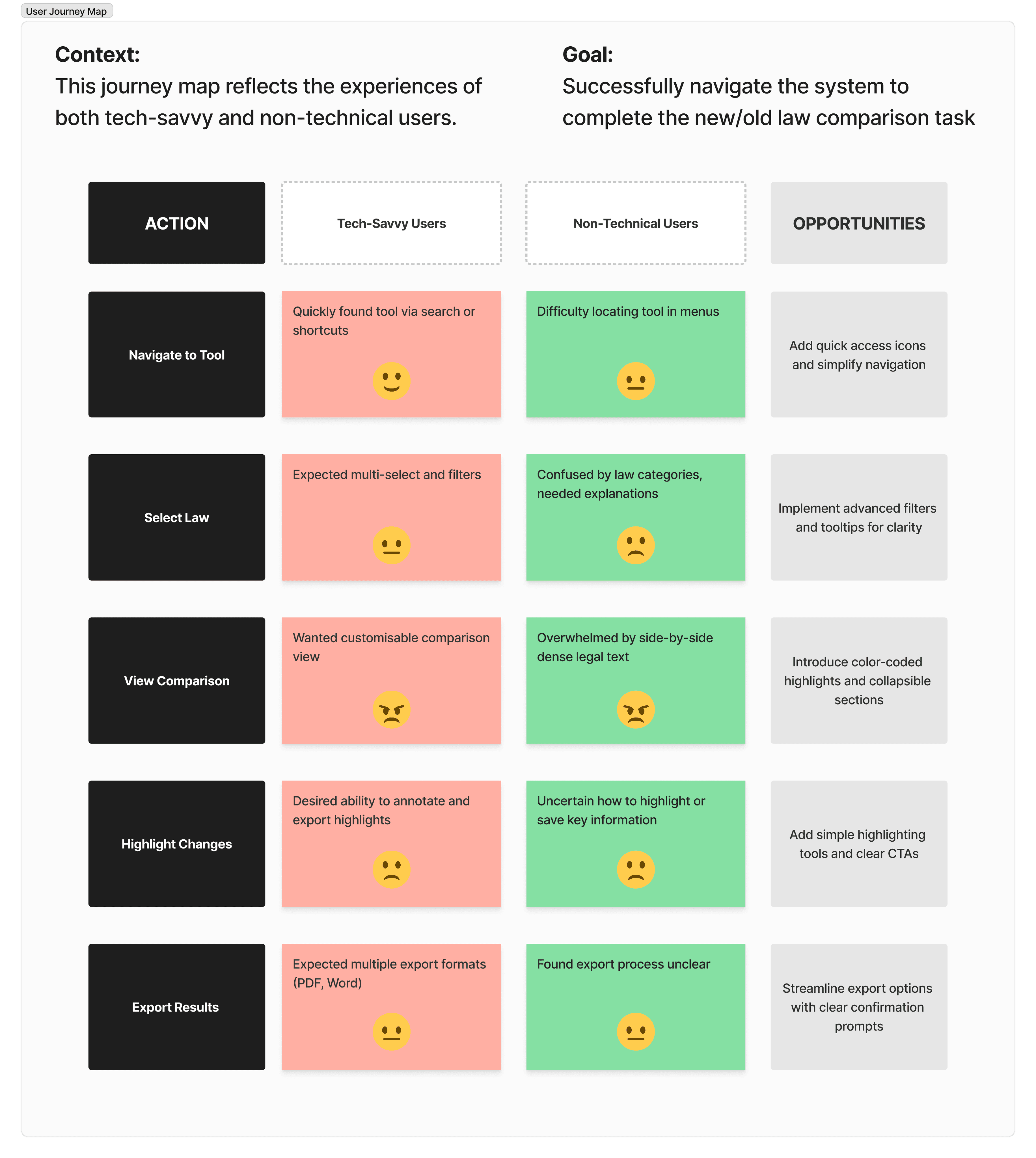
Navigation Complexity & Drop-off Issues
Users struggled to navigate the legal comparison feature, leading to a 35% drop-off rate at the side-by-side comparison step.Diverging Needs: Tech-Savvy vs. Non-Technical Users
Tech-savvy users sought customisation, shortcuts, and advanced filtering options, while non-technical users needed simplified workflows, clear labels, and structured guidance.Overwhelming Legal Text in Comparison View
Both user groups found the side-by-side comparison overwhelming, with dense legal text making it difficult to extract key changes.Lack of Clarity in Actionable Features
Users were uncertain how to highlight key information or export results efficiently due to unclear CTAs and feature placement.
Design Process:
Before & After: Visual Transformation

Prototype
Wireframe
2. Segmentation Analysis:
Grouped users by experience level (legal professionals vs. general public). Focused on simplifying entry points for non-expert users.
3. UX Redesign
• Reworked navigation and feature labels for clarity
• Simplified landing page flows
• Introduced scaffolded content and tooltips for beginners
